S
SNC1923
Guest
Feeback Time II

JohnF, who apparently has a pretty wry sense of humor, is back again with a nice submission. An interesting old building with a bike included, always good. But that it's a dental museum, open wide, well. . . . You see where he's going. Nice.

BMWDean joins us again this week with three submissions of merit. The shot above is simply hilarious. It addresses the theme perfectly and it's just plain funny. Deryle's teeth have a lot of character and I would recommend that he seek work as a tooth model. 500 bonus points (100 each) for the gold crowns--have two myself. My dentist doesn't get it, but I dig 'em.

Another neat, super wideangle shot from BMWDean--motorcycle related, to boot. There is noticeable barrel distortion in this image and severe fall off in the corners. Is this a lens attachment or a lens? In spite of technical imperfections--which do add drama--this is a powerful and exciting shot. Reminds me a bit of a Sport Illustrated shot in a football stadium.

This is a really interesting close-up. It's an F800 engine cut-away or K1200? I remember something like this from last year's show. This is a great angle, nice lighting, just very successsful. Thinking about DoF, the foreground is a bit blurry and the background is not. This is due to where to point of focus (where the AF was pointed) is centered. Nothing serious, just an observation. I generally prefer the foreground focused and the background trailing off. Takes away nothing from this successful effort.

Here's one of mine. Brilliant but flawed. Seriously, I like this shot because it's unusual in that it records a mundane and rarely photogrphed occurance. It's an opening (though hardly wide) and so attempts to address the theme. The shallow DofF really draws attention to the obvious character in Kelly's working-man's hands.
ERROR: Can't display bitmap image
Franze from Switzerland--18 posts--comes in this week with this diminuitive submission. Doesn't really fit the theme that I can see. Also, toooooooo small! But a nice image from a ride and welcome submission from a newer member. "Camera set to idiot." A sense of humor always helps. Post again and thanks for joining us!

Grossjohann is back with a number of submissions this week. The above fails to address the theme and is a fun if ordinary photo. But it garners 10,000 bonus points for including an R1200GSA. Nice.

GJ's second submission is an excellent composition, addresses the theme well, is an excellent example of shallow DoF, and is really, really gross. (50 bonus points)

This should be cropped and displayed. As GJ already asks, what are the odds of capturing a flash in your exposure. A flash's durantion is in the tens-of-thousands of a second range. I'm not a statistician, but those have to be long odds. Neat image.

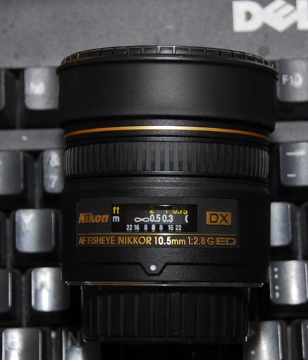
CJack joins us this week with a photo from his other expensive hobby. This is a nice product shot, for lack of a better description. It's a clear image with good color, too. The shadows from the flash are a bit of a bummer, but that can be relieved with a simple and inexpensive reflector. They even make them for SLR cameras with built-in flashes. If I can pick on just one other small thing, if the DoF were just a bit greater, the trains would be in focus, too. The point of focus seems to be on the drawbridge and leaves the trains a bit fuzzy. With all that said, it's a pretty successful effort and looks like a lot of fun. I'll never know because if I came home with model train stuff, my wife would kill me and bury me in the backyard.

Nice to have lamble join us this week, though I miss his old avatar. This is a successful shot that addresses the theme through technique, namely DoF. An otherwise ordinary shot of leaves has so much "punch" because they are set in stark relief to the fuzzy background. A nice shot.

Of the two bridge shots, I like this one better. The angle (from below) adds a sense of drama to the image and the vertical composition is unexpected. We actually have two vertically-composed bridge shots this week--although if we include Deryle's bridge, that's three. I kill me.

How very nice to have Sue Rihn-Manke join us this week with this idyllic sunrise. Sunsets are commonplace subjects, sunrises far less so. This is a beautiful shot that definitely tells a story. I'm not sure if I see revealing an interpretation of the theme (though I could just be a dunderhead) but I don't care--it's a great shot. The inclusion of the tea set (which is actually full of coffee) is splendid. I'm sorry that you missed the steam of the coffee. How great would that have been. The whole shot is a bit undersaturated due to the difficulty of shooting into the sun, but post-processing might help that. Beautiful photo.

Happy to see Burnzilla back this week with a couple of beautiful submissions. This one is gorgeous. This photo is all about light and I can't say enough nice things about it. The texture in the water is magnificent and the overall cast of maroon is just great. This is more like an oil painting than a photograph. The color, light, and texture completely overshadow its ordinary composition. I love this shot.

JDMetzger is back with what may be this week's most unusual submission. He kind of beats this shot up, but I really like it. Very unusual subject and a bold composition, angle of attack. I agree that the vanishing point does sort of prematurely vanish. . . . I wonder if lifting the camera, pointing it down slightly, may have helped? 350 bonus points for creativity. Whereas we like to see the subject off center, rule of thirds, golden mean, and all of that, this shot's absolute and rigid symmetry is what makes is so compelling. This is a shot worth returning to and experimenting with. It's already quite successful. Who knows how it might evolve with further efforts?

This is a bitchin' picture. Fit the theme? I don't know, but I like it a lot. I love the color and that the bike is in partial sillhouette. It's an iconic image, one that would appeal especially to BMW afficianados, but to others as well, I'm guessing. Love the exposure, the twilight in the bottome. I might crop out the goobers in the lower margin, though. Minus 10 points for goobers.

Bricciphoto has already said much of what needs to be said about this fine photo. I really like this. It reminds me, a bit, of the recent shot by Outback UFO. It's no copy, of course, but just a similar study in lines and contrast. Nice submission and a successful effort if I may say. I particularly like the shadowplay on the terrestrial. 100 bonus points for adding "terrestrial" to my vocabulary and 50 bonus points for going to church.
Barring any last-minute submission amidst all the trick or treating, that's all folks. It was a banner week and really nice crop of photos. We've all been thanking each other for our submissions and work, but I would like to add my sincere thanks to everyone who participates and makes this so fun, photographers, critics, and viewers.
Next week's theme will be up in a day or so. Watch for it!
JohnF, who apparently has a pretty wry sense of humor, is back again with a nice submission. An interesting old building with a bike included, always good. But that it's a dental museum, open wide, well. . . . You see where he's going. Nice.
BMWDean joins us again this week with three submissions of merit. The shot above is simply hilarious. It addresses the theme perfectly and it's just plain funny. Deryle's teeth have a lot of character and I would recommend that he seek work as a tooth model. 500 bonus points (100 each) for the gold crowns--have two myself. My dentist doesn't get it, but I dig 'em.
Another neat, super wideangle shot from BMWDean--motorcycle related, to boot. There is noticeable barrel distortion in this image and severe fall off in the corners. Is this a lens attachment or a lens? In spite of technical imperfections--which do add drama--this is a powerful and exciting shot. Reminds me a bit of a Sport Illustrated shot in a football stadium.
This is a really interesting close-up. It's an F800 engine cut-away or K1200? I remember something like this from last year's show. This is a great angle, nice lighting, just very successsful. Thinking about DoF, the foreground is a bit blurry and the background is not. This is due to where to point of focus (where the AF was pointed) is centered. Nothing serious, just an observation. I generally prefer the foreground focused and the background trailing off. Takes away nothing from this successful effort.
Here's one of mine. Brilliant but flawed. Seriously, I like this shot because it's unusual in that it records a mundane and rarely photogrphed occurance. It's an opening (though hardly wide) and so attempts to address the theme. The shallow DofF really draws attention to the obvious character in Kelly's working-man's hands.
ERROR: Can't display bitmap image
Franze from Switzerland--18 posts--comes in this week with this diminuitive submission. Doesn't really fit the theme that I can see. Also, toooooooo small! But a nice image from a ride and welcome submission from a newer member. "Camera set to idiot."
A sense of humor always helps. Post again and thanks for joining us!
Grossjohann is back with a number of submissions this week. The above fails to address the theme and is a fun if ordinary photo. But it garners 10,000 bonus points for including an R1200GSA. Nice.
GJ's second submission is an excellent composition, addresses the theme well, is an excellent example of shallow DoF, and is really, really gross. (50 bonus points)
This should be cropped and displayed. As GJ already asks, what are the odds of capturing a flash in your exposure. A flash's durantion is in the tens-of-thousands of a second range. I'm not a statistician, but those have to be long odds. Neat image.
CJack joins us this week with a photo from his other expensive hobby. This is a nice product shot, for lack of a better description. It's a clear image with good color, too. The shadows from the flash are a bit of a bummer, but that can be relieved with a simple and inexpensive reflector. They even make them for SLR cameras with built-in flashes. If I can pick on just one other small thing, if the DoF were just a bit greater, the trains would be in focus, too. The point of focus seems to be on the drawbridge and leaves the trains a bit fuzzy. With all that said, it's a pretty successful effort and looks like a lot of fun. I'll never know because if I came home with model train stuff, my wife would kill me and bury me in the backyard.
Nice to have lamble join us this week, though I miss his old avatar. This is a successful shot that addresses the theme through technique, namely DoF. An otherwise ordinary shot of leaves has so much "punch" because they are set in stark relief to the fuzzy background. A nice shot.
Of the two bridge shots, I like this one better. The angle (from below) adds a sense of drama to the image and the vertical composition is unexpected. We actually have two vertically-composed bridge shots this week--although if we include Deryle's bridge, that's three. I kill me.
How very nice to have Sue Rihn-Manke join us this week with this idyllic sunrise. Sunsets are commonplace subjects, sunrises far less so. This is a beautiful shot that definitely tells a story. I'm not sure if I see revealing an interpretation of the theme (though I could just be a dunderhead) but I don't care--it's a great shot. The inclusion of the tea set (which is actually full of coffee) is splendid. I'm sorry that you missed the steam of the coffee. How great would that have been. The whole shot is a bit undersaturated due to the difficulty of shooting into the sun, but post-processing might help that. Beautiful photo.
Happy to see Burnzilla back this week with a couple of beautiful submissions. This one is gorgeous. This photo is all about light and I can't say enough nice things about it. The texture in the water is magnificent and the overall cast of maroon is just great. This is more like an oil painting than a photograph. The color, light, and texture completely overshadow its ordinary composition. I love this shot.
JDMetzger is back with what may be this week's most unusual submission. He kind of beats this shot up, but I really like it. Very unusual subject and a bold composition, angle of attack. I agree that the vanishing point does sort of prematurely vanish. . . . I wonder if lifting the camera, pointing it down slightly, may have helped? 350 bonus points for creativity. Whereas we like to see the subject off center, rule of thirds, golden mean, and all of that, this shot's absolute and rigid symmetry is what makes is so compelling. This is a shot worth returning to and experimenting with. It's already quite successful. Who knows how it might evolve with further efforts?
This is a bitchin' picture. Fit the theme? I don't know, but I like it a lot. I love the color and that the bike is in partial sillhouette. It's an iconic image, one that would appeal especially to BMW afficianados, but to others as well, I'm guessing. Love the exposure, the twilight in the bottome. I might crop out the goobers in the lower margin, though. Minus 10 points for goobers.
Bricciphoto has already said much of what needs to be said about this fine photo. I really like this. It reminds me, a bit, of the recent shot by Outback UFO. It's no copy, of course, but just a similar study in lines and contrast. Nice submission and a successful effort if I may say. I particularly like the shadowplay on the terrestrial. 100 bonus points for adding "terrestrial" to my vocabulary and 50 bonus points for going to church.
Barring any last-minute submission amidst all the trick or treating, that's all folks. It was a banner week and really nice crop of photos. We've all been thanking each other for our submissions and work, but I would like to add my sincere thanks to everyone who participates and makes this so fun, photographers, critics, and viewers.
Next week's theme will be up in a day or so. Watch for it!
Last edited:


")

