gregfeeler
Dances With Sheep
Updated Images
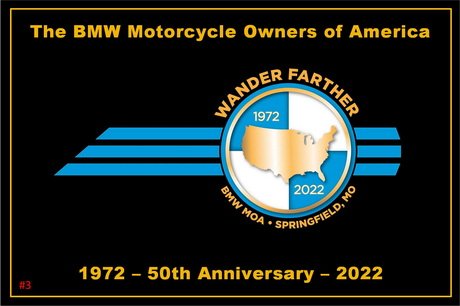
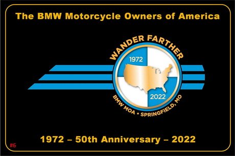
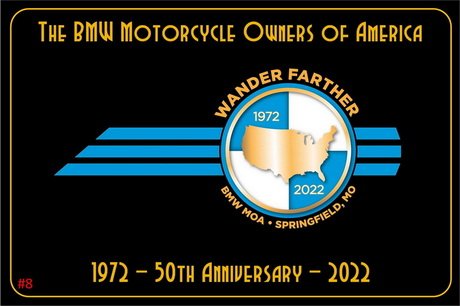
I tallied the responses so:
#6 - 12 votes
#3 - 5 votes
#7 - 3 votes
All the others got one or none, so I've tossed out all but #6 and #3. There were 9 votes for rounded corners, so I offer these two new versions combining these votes: #8 is #6 with a rounded boarder line and the art deco font, and #9 is #3 with just the change to a rounded boarder line. So, what I would call a "traditional" header and footer text layout the most popular layout. I have included the original #3 and #6 so you can view them on one page. With the two original designs and the two new variations, you have every combination of boarder and font. On most screens if you adjust the web page width correctly you can get #3 and #9 side-by-side on one row, and #6 and #8 on a row below. The polls are open. Thanks to everyone for their input!