S
SNC1923
Guest
Photo Commentary
Another fine crop of photos this week. I hope everyone is enjoying this as much as I am. I'm very appreciative of people being willing to post a picture and leave it for others to talk about. Let's get to it.

RTRandy has the first entry this week. As he points out, this is "kind of in thirds." It's a worthy snapshot and one that does seem to tell a story. What strikes me about this photo is its frantic background with so many different things to see: dough, containers, people, counters, and those crazy spoons tilting this way and that. It can be nerve-wracking to point your camera into someone's private space and snap a shot. No idea if this was his experience or not. The colors are a bit muted. There is a way to boost contrast and saturation in your camera's menu. You might consider experimenting with that if it bothers you. A fun shot with a cool ride story attached. Mmmmm, fried pies. . . .

Our next photographer is Grossjohann who graced us with six nice images, each worthy of discussion; however, as the hour is late, I shall limit myself two, both great examples of thoughtful composition. The shot above is a good example of the rule of thirds, horizontally dividing the photo between a stone wall, mountain/valley vista, and blue sky. Interestingly, the photo can be seen as divided vertically into thirds as well. He places his subject, one these "pay-scopes" in the left third of the image, evoking this "golden mean" or dynamic symmetry to some degree. It's an interesting and well-executed photo that many other photographers might have taken with the scope in the dead-center of the image. Nice shot.

The other photo that grabbed my eye was this one. It has all the same elements mentioned above. The proportions are different, but it's still divided into three. And the subject placement occupies this lover quadrant of the picture--really nice. Although it clearly was not the photographer's intent, how neat would it have been to arrange this subject and composition with a bike in the background. So many people see a BMW key fob and think "car," and such an image would shake their preconceived notions. But I digress; I didn't take this photo, did I? It's a neat still-life: good focus and attention to detail.

Bobh41 snapped this shot on his way, apparently, to the open house? It's a nice scene, bucolic really but for the factory in the distance. It's a pleasant photo, but one seemingly without a central subject. Clearly these rolled hay bales are of interest (especially to we left-coasters where they don't exist) but no one stands out. I saw thousands of these on the way to Wisconsin and wondered about them. Apparently a very efficient way to bale the hay. In any case, were he to have had the opportunity, moving so that one hay bale was large and in the foreground may have made this nice photo even more interesting. There, too, the photographer may have made the decision to exclude--or intentionally include--the factory in the background.
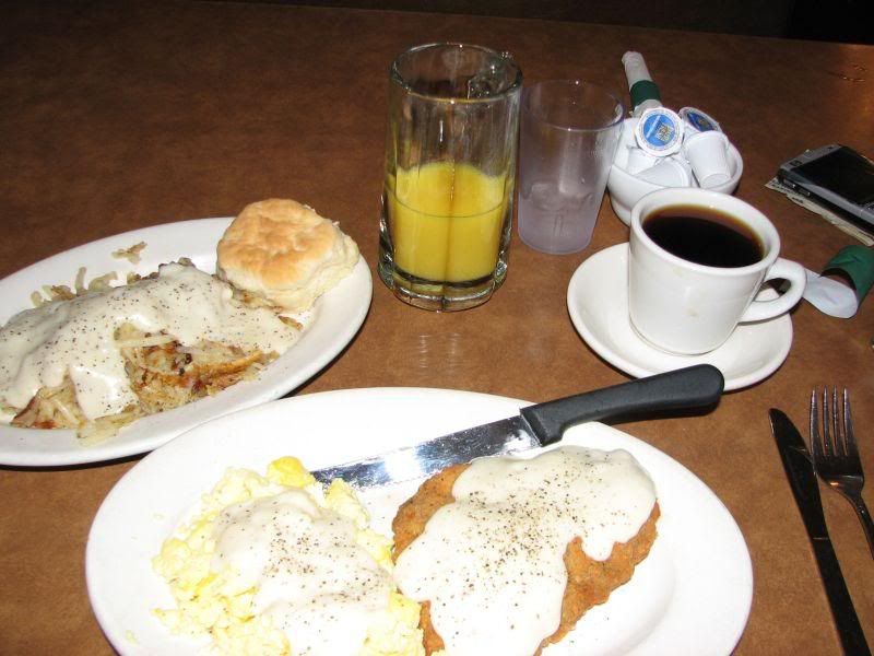
PAGoldsby's image is certainly in thirds. It is decidedly UNbalanced. I can hear my arteries constricting just looking at this photo. What I find most interesting about this is that the biscuit is the only thing that DOESN'T have gravy on it. I wouldn't have been surprised to see gravy in the coffee. One thing's for sure: Beemer pilots sure know how to eat.

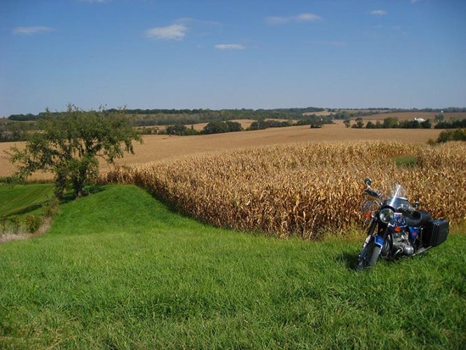
Buckeyeclark's entry is a study in contrasts. First of all, it's a photo taken of a much-loved bike. We all have photos like this. And it's understandable: this is a nice bike worthy of taking photos. The background composition is nicely divided into thirds, making an excellent backdrop--and contrast--to the bike. However, the bike is dead-center, and it would be much more effective if it were composed in one corner or the other, leading the viewer's eye. In addition, this might help to eliminate the troubling tree trunks growing out of the seat. I've taken thousands of pictures like this, really pleased with the composition, only to discover later that I have some element jutting from somewhere inappropriate. This by no means ruins the picture, but it might prevent it from being published or framed. . . . I do like the angle from which the bike was shot. If flash had been added it may have lightened the image and boosted the contrast. A nice image and one well worth repeating.
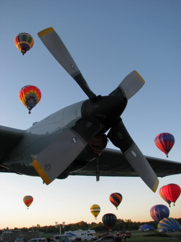
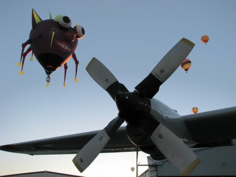
Paulbach turned in three images this week, all nice photos, but this one knocks my socks off. This is a great, eye-catching image that I love for numerous reasons. First, it's an inventive composition. The image is divided into horizontal thirds, but it's also divided along the axis of the propeller. It is an obvious contrast between two remarkably different kinds of flight. To me, however, the most striking aspect of this image is its perfect complexity. There are 9 hovering balloons but none cross the wing or propeller. Nothing overlaps, making for a striking and--in some respects--surreal image. This one really struck my fancy.
Compare this image above with Paul's first entry, a similar but far less remarkable image. It gives you a good idea of how powerful the decision can be to place the subject elsewhere in the image, or in this case, to foreground and make it larger.

I like this week's image from Voni--a really nice shot. The background is divided into thirds of a sort. The sky, the desert, and the gravel drive. But the placement of the subject (Paul I presume) in the lower-right quadrant is another good example of the golden mean. If you compare this with last week's entry (boys on bicycles) you can see--in terms of composition--what tremendously different pictures they are. I love the foreboding sky in this picture--really tells a story.

Burnzilla's entry this week is a great photo of a beautiful scene in a beautiful part of California. He's lucky to live anywhere near there. Beautiful composition: background in thirds and the Cypress, poised above a beautiful little cove off to the side--great dynamic symmetry. This is a textbook example of composition study and a very nice photo besides.

Here is Bricciphoto's entry. I'm going to include his own critique as I agree with almost everything he says:
Bull's Eye Composition
Human Tripod Shooting Perspective
Underexposed
In general, a rather "lazy" effort.
What do I think might have made this more compelling?
Place Subject Slightly Off Center in Frame
Lower or Higher Shooting Perspective (Most Likely Lower: Ground Level?)
Tighter Crop to Minimize Background or Showing Just Her Feet/Left Foot
Exposing for a Silhouette
It is, in fact, bull's eye composition and is "human tripod" perspective. I've never heard that term before, but I immediately know what it means. I think "lazy" is a bit harsh. I definitely would not crop this tighter, unless I were going to have part of the subject disappear off frame. However a slight lower shooting perspective might have been interesting. There's something appealing about this shot--an anthropomorphising (not actually a word, but making a person out of the) motorcycle. A man-and-machine, or person-and-machine thing. . . .
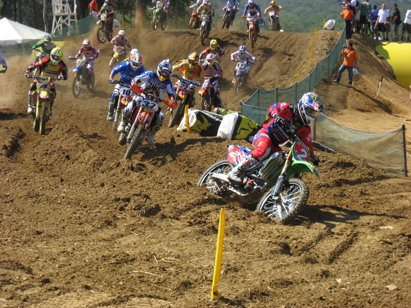
Visian's entry is a really beauty. Great colors and composition. I agree with his assessment that it may have worked even better were it angled up a bit. Still, it's a great static image of an exciting and dynamic subject. Great colors and great contrast in this image. The subject, whom I perceive to be No. 2, is not dead-center, but placed in magic spot where the viewer's eye goes. The very composition of this shot is what tells its story.

Clearly 2bikemike has a far greater sense of balance--in his diet--than PAGoldsby. Though I don't know about those Vienna sausages; although I'm not one to talk. My diet is a disaster. I especially like how his dietary composition makes a smiley face, a prototypical happy meal if you will. And you will.
Well, that's it for this week, barring any last-minute entries. A fine and fun crop of photos. Please feel free to offer your comments or to counter mine. This is just one person's opinion, offered at least two hours after his bed-time.
Another fine crop of photos this week. I hope everyone is enjoying this as much as I am. I'm very appreciative of people being willing to post a picture and leave it for others to talk about. Let's get to it.
RTRandy has the first entry this week. As he points out, this is "kind of in thirds." It's a worthy snapshot and one that does seem to tell a story. What strikes me about this photo is its frantic background with so many different things to see: dough, containers, people, counters, and those crazy spoons tilting this way and that. It can be nerve-wracking to point your camera into someone's private space and snap a shot. No idea if this was his experience or not. The colors are a bit muted. There is a way to boost contrast and saturation in your camera's menu. You might consider experimenting with that if it bothers you. A fun shot with a cool ride story attached. Mmmmm, fried pies. . . .
Our next photographer is Grossjohann who graced us with six nice images, each worthy of discussion; however, as the hour is late, I shall limit myself two, both great examples of thoughtful composition. The shot above is a good example of the rule of thirds, horizontally dividing the photo between a stone wall, mountain/valley vista, and blue sky. Interestingly, the photo can be seen as divided vertically into thirds as well. He places his subject, one these "pay-scopes" in the left third of the image, evoking this "golden mean" or dynamic symmetry to some degree. It's an interesting and well-executed photo that many other photographers might have taken with the scope in the dead-center of the image. Nice shot.
The other photo that grabbed my eye was this one. It has all the same elements mentioned above. The proportions are different, but it's still divided into three. And the subject placement occupies this lover quadrant of the picture--really nice. Although it clearly was not the photographer's intent, how neat would it have been to arrange this subject and composition with a bike in the background. So many people see a BMW key fob and think "car," and such an image would shake their preconceived notions. But I digress; I didn't take this photo, did I? It's a neat still-life: good focus and attention to detail.
Bobh41 snapped this shot on his way, apparently, to the open house? It's a nice scene, bucolic really but for the factory in the distance. It's a pleasant photo, but one seemingly without a central subject. Clearly these rolled hay bales are of interest (especially to we left-coasters where they don't exist) but no one stands out. I saw thousands of these on the way to Wisconsin and wondered about them. Apparently a very efficient way to bale the hay. In any case, were he to have had the opportunity, moving so that one hay bale was large and in the foreground may have made this nice photo even more interesting. There, too, the photographer may have made the decision to exclude--or intentionally include--the factory in the background.
PAGoldsby's image is certainly in thirds. It is decidedly UNbalanced. I can hear my arteries constricting just looking at this photo. What I find most interesting about this is that the biscuit is the only thing that DOESN'T have gravy on it. I wouldn't have been surprised to see gravy in the coffee. One thing's for sure: Beemer pilots sure know how to eat.
Buckeyeclark's entry is a study in contrasts. First of all, it's a photo taken of a much-loved bike. We all have photos like this. And it's understandable: this is a nice bike worthy of taking photos. The background composition is nicely divided into thirds, making an excellent backdrop--and contrast--to the bike. However, the bike is dead-center, and it would be much more effective if it were composed in one corner or the other, leading the viewer's eye. In addition, this might help to eliminate the troubling tree trunks growing out of the seat. I've taken thousands of pictures like this, really pleased with the composition, only to discover later that I have some element jutting from somewhere inappropriate. This by no means ruins the picture, but it might prevent it from being published or framed. . . . I do like the angle from which the bike was shot. If flash had been added it may have lightened the image and boosted the contrast. A nice image and one well worth repeating.
Paulbach turned in three images this week, all nice photos, but this one knocks my socks off. This is a great, eye-catching image that I love for numerous reasons. First, it's an inventive composition. The image is divided into horizontal thirds, but it's also divided along the axis of the propeller. It is an obvious contrast between two remarkably different kinds of flight. To me, however, the most striking aspect of this image is its perfect complexity. There are 9 hovering balloons but none cross the wing or propeller. Nothing overlaps, making for a striking and--in some respects--surreal image. This one really struck my fancy.
Compare this image above with Paul's first entry, a similar but far less remarkable image. It gives you a good idea of how powerful the decision can be to place the subject elsewhere in the image, or in this case, to foreground and make it larger.
I like this week's image from Voni--a really nice shot. The background is divided into thirds of a sort. The sky, the desert, and the gravel drive. But the placement of the subject (Paul I presume) in the lower-right quadrant is another good example of the golden mean. If you compare this with last week's entry (boys on bicycles) you can see--in terms of composition--what tremendously different pictures they are. I love the foreboding sky in this picture--really tells a story.
Burnzilla's entry this week is a great photo of a beautiful scene in a beautiful part of California. He's lucky to live anywhere near there. Beautiful composition: background in thirds and the Cypress, poised above a beautiful little cove off to the side--great dynamic symmetry. This is a textbook example of composition study and a very nice photo besides.
Here is Bricciphoto's entry. I'm going to include his own critique as I agree with almost everything he says:
Bull's Eye Composition
Human Tripod Shooting Perspective
Underexposed
In general, a rather "lazy" effort.
What do I think might have made this more compelling?
Place Subject Slightly Off Center in Frame
Lower or Higher Shooting Perspective (Most Likely Lower: Ground Level?)
Tighter Crop to Minimize Background or Showing Just Her Feet/Left Foot
Exposing for a Silhouette
It is, in fact, bull's eye composition and is "human tripod" perspective. I've never heard that term before, but I immediately know what it means. I think "lazy" is a bit harsh. I definitely would not crop this tighter, unless I were going to have part of the subject disappear off frame. However a slight lower shooting perspective might have been interesting. There's something appealing about this shot--an anthropomorphising (not actually a word, but making a person out of the) motorcycle. A man-and-machine, or person-and-machine thing. . . .
Visian's entry is a really beauty. Great colors and composition. I agree with his assessment that it may have worked even better were it angled up a bit. Still, it's a great static image of an exciting and dynamic subject. Great colors and great contrast in this image. The subject, whom I perceive to be No. 2, is not dead-center, but placed in magic spot where the viewer's eye goes. The very composition of this shot is what tells its story.
Clearly 2bikemike has a far greater sense of balance--in his diet--than PAGoldsby. Though I don't know about those Vienna sausages; although I'm not one to talk. My diet is a disaster. I especially like how his dietary composition makes a smiley face, a prototypical happy meal if you will. And you will.
Well, that's it for this week, barring any last-minute entries. A fine and fun crop of photos. Please feel free to offer your comments or to counter mine. This is just one person's opinion, offered at least two hours after his bed-time.