Navigation
Install the app
How to install the app on iOS
Follow along with the video below to see how to install our site as a web app on your home screen.
Note: This feature may not be available in some browsers.
More options
-
Welcome, Guest! We hope you enjoy the excellent technical knowledge, event information and discussions that the BMW MOA forum provides. Some forum content will be hidden from you if you remain logged out. If you want to view all content, please click the 'Log in' button above and enter your BMW MOA username and password. If you are not an MOA member, why not take the time to join the club, so you can enjoy posting on the forum, the BMW Owners News magazine, and all of the discounts and benefits the BMW MOA offers?
-
Beginning April 1st, and running through April 30th, there is a new 2024 BMW MOA Election discussion area within The Club section of the forum. Within this forum area is also a sticky post that provides the ground rules for participating in the Election forum area. Also, the candidates statements are provided. Please read before joining the conversation, because the rules are very specific to maintain civility.
The Election forum is here: Election Forum
You are using an out of date browser. It may not display this or other websites correctly.
You should upgrade or use an alternative browser.
You should upgrade or use an alternative browser.
deep thoughts
- Thread starter gtgt_bangbang
- Start date
gtgt_bangbang
New member
tbomk,
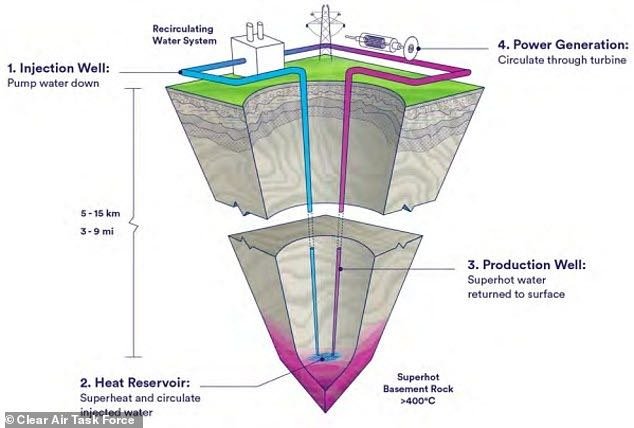
drilling technology is the hold-up but a low down engineering issue, not a dirty mining/refuse one
drilling technology is the hold-up but a low down engineering issue, not a dirty mining/refuse one
gtgt_bangbang
New member
I see some electric pumps are involved, for circulation, but afaik, those aren't perpetual,
they break 1 week after warranty expires or a month after the new model is introduced,
which ever comes first.
However the point of this generator is to tap the more or less perpetual heat
in the earth's crust / upr mantle / (disclaimer; Neither a geologist nor a wanna be.)
Heat differential enough to drive a turbine ... without combustion.
Take a ride across US80 in NV to see some small scale stuff like this already MW'atting
( steam fields)
Yeah true the earth will someday ice up into a snowball (climate scam or no) but for discussions sake,
lets accept the earth as an "infinite" reservoir of v.high temperatures.
There are domes where extremely hot rock is much closer to surface than elsewhere.
These are the first sites (... to protest the drilling of poor poor Gaia )
Drilling that deep is major hurdle & still beyond reach for a number of reasons,
but some of those petro / mining guys are some pretty sharp tools.
Not going to bother look up much, but IIR, fracking wasn't so much a geological discovery,
as a drilling technique development.
My gut feel is this is the type tech we should be investing in,
instead of heavily subsidized, 20~30 year life span, near-net-zero (cost benefit, all in )
& throughly un-recyclable Intermittent / Unreliable's which simply won't scale.
not going even touch on pebble bed or other "portable" reactors,
even though THOSE sources are already within our short grasp,
all verklemtpers aside .
Small scale nuc could serve as both low level waste containment,
AND make power so cheap, it aint worth metering.
at such time, we can economically run calcination plants
to make cheap & quite handy concrete meanwhile restoring atmospheric CO2
to healthy & productive levels
before the coral beds checkmate all other Carbon based life
( JK! fact is , Earth death due to ocean sequestration like that is millions of years from now so don't pop any corks just yet ! although fact is near extinction levels of LOW CO2 were reached previously , and are utterly inevitable unless s/thing else intercedes
Last edited:
There are already 10 such Geothermal powerplants near the Salton Sea in California, which by coincidence has one of the largest lithium deposits in the world. The lithium is contained in the brine that comes up to run the turbines. They are now looking into methods removing the lithium before it is pumped back into the earth. Not only a power source, but some of the material to make the batteries to store that energy. Supposedly there is enough lithium to make 50 MILLION EV batteries!
It’s amazing what we can come up with when there is a need and a guaranteed market!
The best thing that happened to lighting was the outlawing of incandescent bulbs BEFORE there was an efficient or quality replacement. That allowed companies to invest millions in lighting technology knowing that there would be a guaranteed market for the resulting tech. Unfortunately we had to go through the less than adequate compact fluorescent phase, but that eventually led to the money being poured in to LEDs which had been around for decades, but hadn’t been fully developed mostly from lack of financial incentive. The banning of sale of incandescents, guaranteeing a solid market for the replacement, justified the R&D investment. What we have now is lightyears better than incandescents, for most applications.
It took a while and there was a lot of kicking and screaming along the way, but I don’t think we would be where we are today in regards to the advancement in lighting technology without the ban on incandescent sales.


Last edited:
( JK! fact is , Earth death due to ocean sequestration like that is millions of years from now so don't pop any corks just yet ! although fact is near extinction levels of LOW CO2 were reached previously , and are utterly inevitable unless s/thing else intercedes
I know of no one who is concerned with earth death. It’s not going anywhere regardless of conditions. It’s the conditions that are conducive to HUMAN life and related animal and plant life that has everyone concerned. Changing food production capabilities, lack of potable water, the potential for hundreds of millions of people needing to relocate because of changing coastlines won’t bother Mother Earth in the least, but might be a tad inconvenient to Humanity. And it won’t take millions of years as you suggest. When things get out of balance, they tend to go bad exponentially.


gtgt_bangbang
New member
I know of no one who is concerned with earth death.
had a more in depth reply but somehow zottttted it just before [Submit] arggggh but Sorry & not gonna redo, althogh ;
yeah aint nobody no how worried about shell life threatening Civilization.
Still, its sort of funny to realize it. Com'on... the irony of limestone !
but safe to say , the Seas are in steady state, notably, a constant slow rise rate ( following a fast rise, post-Ice Age) that looooong preceded the Age of Combustion;
Inundated low-land & coast lines in Presetn Times is nonsense by any honest reading of the real data.
aint nobody I know fighting for dirtier water , but dirty water has an ~inverse relationship to CO2, if you think about it;
'Environment" is the always the 2nd human concern... AFTER subsistance,
and Access to Energy has been the secret to Success ...
CO2 makes things green. The very stuff of life. Expands Green Zones to drier climes.
Stoma (the Freight Dock on a leaf) close once sated with CO2, which reduces the water loss through those pores.
More water stays in the root. Drier climates turn grren. Ask you local hot house operator.
Green is good for plant-dependent species ( are there any other kind ?)
"When things get out of balance, they tend to go bad exponentially." is a wholly non-Physics concept.
That just aint so. Thats a motif, not a modus.
GREENLAND's ICE (ACCUMULATION) ( accumulation ... ACCUMULATION ... ie, not melting ...)

EYES UP ! She has a point, a couple in fact, but please focus on THE DATA .... not the tata.
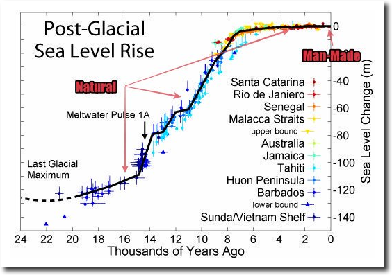
Sea level through time; melting world wide glaciers are noticeable. Sea-level thermal expansion since the last Great Ice Age meltdown is not an issue to fear nor tax.
Last edited:
So, if I understand your first graph correctly, every data point on that graph indicates that the Greenland ice accumulation (ice not melting) is below the mean? Would that then infer that, for those years, the amount of ice that IS melting is ABOVE the mean? That would seem to agree with what most who study that kind of thing have been trying to make people aware of, no?
EDIT; Sorry, I mis interpreted the “mean” legend on the chart. I’m multi tasking, watching the Warriors game, eating dinner, messing with my Ipad on the forum, and not fully paying attention to anything. I now see that the mean is represented by the gray zone (not the gray line), but you used the mean of the years 1981-2010. It would have been more relavent had you used the mean of the hundred years or so BEFORE THE INDUSTRIAL REVOLUTION and chart the years since, instead of just a couple years. Geological change does not just happen in a couple of years. (Usually)
Your second graphs scales are so high that it makes any attempts at relevance useless. To represent the effects of the industrial revolution both in time and rising sea level height by one or two pixels at the end of the graph shows nothing. Although that rapid rise of sea level after the last ice age surely disrupted whatever human populations there were (people always have lived at the waters edge), we wouldn’t have any written history of the effects until the last 1/4” of your graph.
Which other parts of that graph since the last ice age would you suggest represents conditions that would have no traumatic effects on our current civilizations ?
Remember, less than 8’ of sea level rise will put a good portion of Miami, Venice, Holland, and Indonesia underwater, displacing millions of people. The first number on your chart is 40’. Most of Florida would be gone at that point. Could you imagine the disruption when all those millions of people have to move in with their children in New York?..
That’s pretty good. You show one graph with a tiny sample size and one with a huge sample size but neither tells anything about what is happening. Was that intentional?
For a bit better perspective, how about revealing which corner of this complex and diverse continent you reside in?


EDIT; Sorry, I mis interpreted the “mean” legend on the chart. I’m multi tasking, watching the Warriors game, eating dinner, messing with my Ipad on the forum, and not fully paying attention to anything. I now see that the mean is represented by the gray zone (not the gray line), but you used the mean of the years 1981-2010. It would have been more relavent had you used the mean of the hundred years or so BEFORE THE INDUSTRIAL REVOLUTION and chart the years since, instead of just a couple years. Geological change does not just happen in a couple of years. (Usually)
Your second graphs scales are so high that it makes any attempts at relevance useless. To represent the effects of the industrial revolution both in time and rising sea level height by one or two pixels at the end of the graph shows nothing. Although that rapid rise of sea level after the last ice age surely disrupted whatever human populations there were (people always have lived at the waters edge), we wouldn’t have any written history of the effects until the last 1/4” of your graph.
Which other parts of that graph since the last ice age would you suggest represents conditions that would have no traumatic effects on our current civilizations ?
Remember, less than 8’ of sea level rise will put a good portion of Miami, Venice, Holland, and Indonesia underwater, displacing millions of people. The first number on your chart is 40’. Most of Florida would be gone at that point. Could you imagine the disruption when all those millions of people have to move in with their children in New York?..

That’s pretty good. You show one graph with a tiny sample size and one with a huge sample size but neither tells anything about what is happening. Was that intentional?
For a bit better perspective, how about revealing which corner of this complex and diverse continent you reside in?


Last edited:
I don’t remember how to add a graph to the forum with my pad and it’s bedtime, but you could add a graph like this. I was only able to add the commentary. I’m sure you can find hundreds of similar graphs that actually show relevant information.
The graph shows how sea level changed over the past 2000 years. There are four phases:
Stable sea level from 200 BC until 1000 AD
A 400-year rise by about 6 cm per century up to 1400 AD
Another stable period from 1400 AD up to the late 19th C
A rapid rise by about 20 cm since.
Kemp_sealevel_2011


The graph shows how sea level changed over the past 2000 years. There are four phases:
Stable sea level from 200 BC until 1000 AD
A 400-year rise by about 6 cm per century up to 1400 AD
Another stable period from 1400 AD up to the late 19th C
A rapid rise by about 20 cm since.
Kemp_sealevel_2011


gtgt_bangbang
New member
There are several take-aways from the Flyin None-oyo-Bizzness's spectacular graph, but Facts dont change by zip code.
Foremost, ICE (aka solid-state sea water) IS ACCUMULATING at higher latitudes.
I imagine Joe Average is fretting "THE POLES ARE MELTING ! " when in fact the Great Ice Sheets ~at both poles ~ are Accumulating, GROWING IN MASS, ie GAINING WATER.
OK the exact topography varies, but the mass balance is, was and remains foreseeably positive.
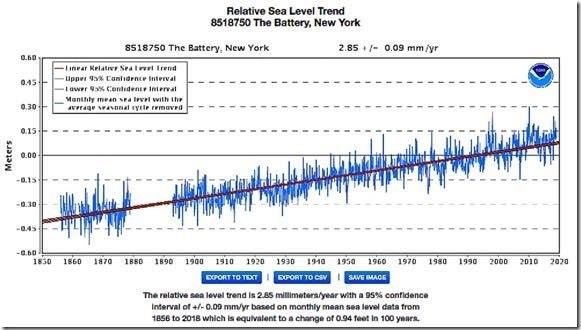
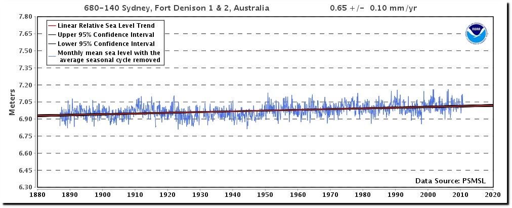
Current Sea level rise is slow & VERY steady since well before the Industrial Age ( which is was and foreseeably remains COAL POWERED)
If ~2.85mm/year ( The Battery, NY .. .steady since 1830. see below) or 0.65 (Sydny Oz) is frightening,
then DON'T BUILD CITIES ON SAND BARS
Also interesting is that the last few years , Ice Accumulation has been well ABOVE average, but only the lean year made Front Page. Wonder why ...
But a "few years" is weather, and weather aint climate.
So, the true fact that Northern Hemisphere '22-'23 Snow Cover is at a ~50 year high is only passingly interesting,
but talk about your Inconvenient Truths ! I sure hope Mr Gore can find another mansion , next one further South. and bigger!
cos his $30K/annual power bills are OK, when others are paying the Load.
Al has done very well thanks guiding the Science® ( firing the dissenting factions) ,
especially considering he took but ONE science course (& got a solid C ... but from am early-on climate zealot)
The scam is maintained by banner headlines showing icebergs tumbling off at glacier mouths --- which is exactly how a river ( even an ice river ) operates,
and ignoring that the watershed FEEDING that river is piling up , although that the exact calving -point, the outlet, can and certainly do vary with time.
There was a exceptional cold snap in the 70s; there was a short-lived but very real academic panic (& magazine sales device)
that snow was going to top the Empire St Bldg, yada yada, ...
I remember it best as some fantastic hockey ponds which hadn't froze before or since.
Plus, nothing like Driveway Hockey Month on a 1/2" sleet sheet rink just out the bac kdoor ! .
Lacking a home brew zamboni, we kept the ice smooth for a week ~ two with the garden hose, but destroyed it eventually.
BUt the real point of that is ; the 70s Cold Snap is often used as the starting point / 0.0 origin for fear-monger graphs,
since there is in fact a general warming since.
None of which makes sense from a "CO2 = Disastrous Climate Change" perspective,
but the whole point is to panic good people into operating against their own self interest,
and not to modify the weather by shifting billion$ of subsidy to generous friends holding Asian-fabbed solar-cell contracts.
Meanwhile at the opposite pole ;
NASA Study: Mass Gains of Antarctic Ice Sheet Greater than Losses
https://www.nasa.gov/feature/goddar...ns-of-antarctic-ice-sheet-greater-than-losses
datline "Antarctic Peninsula; A new NASA study says that Antarctica is overall accumulating ice. Still, areas of the continent, like the Antarctic Peninsula photographed above, have increased their mass loss in the last decades. The research challenges the conclusions of other studies, including the IPCC Intergovernmental Panel on Climate Change’s (IPCC) 2013 report, which says that Antarctica is overall losing land ice.
According to the new analysis of satellite data, the Antarctic ice sheet showed a net gain of 112 billion tons of ice a year from 1992 to 2001.
WHERE is the SL Rise acceleration ??
Foremost, ICE (aka solid-state sea water) IS ACCUMULATING at higher latitudes.
I imagine Joe Average is fretting "THE POLES ARE MELTING ! " when in fact the Great Ice Sheets ~at both poles ~ are Accumulating, GROWING IN MASS, ie GAINING WATER.
OK the exact topography varies, but the mass balance is, was and remains foreseeably positive.
Current Sea level rise is slow & VERY steady since well before the Industrial Age ( which is was and foreseeably remains COAL POWERED)
If ~2.85mm/year ( The Battery, NY .. .steady since 1830. see below) or 0.65 (Sydny Oz) is frightening,
then DON'T BUILD CITIES ON SAND BARS
Also interesting is that the last few years , Ice Accumulation has been well ABOVE average, but only the lean year made Front Page. Wonder why ...
But a "few years" is weather, and weather aint climate.
So, the true fact that Northern Hemisphere '22-'23 Snow Cover is at a ~50 year high is only passingly interesting,
but talk about your Inconvenient Truths ! I sure hope Mr Gore can find another mansion , next one further South. and bigger!
cos his $30K/annual power bills are OK, when others are paying the Load.
Al has done very well thanks guiding the Science® ( firing the dissenting factions) ,
especially considering he took but ONE science course (& got a solid C ... but from am early-on climate zealot)
The scam is maintained by banner headlines showing icebergs tumbling off at glacier mouths --- which is exactly how a river ( even an ice river ) operates,
and ignoring that the watershed FEEDING that river is piling up , although that the exact calving -point, the outlet, can and certainly do vary with time.
There was a exceptional cold snap in the 70s; there was a short-lived but very real academic panic (& magazine sales device)
that snow was going to top the Empire St Bldg, yada yada, ...
I remember it best as some fantastic hockey ponds which hadn't froze before or since.
Plus, nothing like Driveway Hockey Month on a 1/2" sleet sheet rink just out the bac kdoor ! .
Lacking a home brew zamboni, we kept the ice smooth for a week ~ two with the garden hose, but destroyed it eventually.
BUt the real point of that is ; the 70s Cold Snap is often used as the starting point / 0.0 origin for fear-monger graphs,
since there is in fact a general warming since.
None of which makes sense from a "CO2 = Disastrous Climate Change" perspective,
but the whole point is to panic good people into operating against their own self interest,
and not to modify the weather by shifting billion$ of subsidy to generous friends holding Asian-fabbed solar-cell contracts.
Meanwhile at the opposite pole ;
NASA Study: Mass Gains of Antarctic Ice Sheet Greater than Losses
https://www.nasa.gov/feature/goddar...ns-of-antarctic-ice-sheet-greater-than-losses
datline "Antarctic Peninsula; A new NASA study says that Antarctica is overall accumulating ice. Still, areas of the continent, like the Antarctic Peninsula photographed above, have increased their mass loss in the last decades. The research challenges the conclusions of other studies, including the IPCC Intergovernmental Panel on Climate Change’s (IPCC) 2013 report, which says that Antarctica is overall losing land ice.
According to the new analysis of satellite data, the Antarctic ice sheet showed a net gain of 112 billion tons of ice a year from 1992 to 2001.
So, if I understand your first graph correctly, every data point on that graph indicates that the Greenland ice accumulation (ice not melting) is below the mean? Would that then infer that, for those years, the amount of ice that IS melting is ABOVE the mean? That would seem to agree with what most who study that kind of thing have been trying to make people aware of, no?
EDIT; Sorry, I mis interpreted the “mean” legend on the chart. I’m multi tasking, watching the Warriors game, eating dinner, messing with my Ipad on the forum, and not fully paying attention to anything. I now see that the mean is represented by the gray zone (not the gray line), but you used the mean of the years 1981-2010. It would have been more relavent had you used the mean of the hundred years or so BEFORE THE INDUSTRIAL REVOLUTION and chart the years since, instead of just a couple years. Geological change does not just happen in a couple of years. (Usually)
Your second graphs scales are so high that it makes any attempts at relevance useless. To represent the effects of the industrial revolution both in time and rising sea level height by one or two pixels at the end of the graph shows nothing. Although that rapid rise of sea level after the last ice age surely disrupted whatever human populations there were (people always have lived at the waters edge), we wouldn’t have any written history of the effects until the last 1/4” of your graph.
Which other parts of that graph since the last ice age would you suggest represents conditions that would have no traumatic effects on our current civilizations ?
Remember, less than 8’ of sea level rise will put a good portion of Miami, Venice, Holland, and Indonesia underwater, displacing millions of people. The first number on your chart is 40’. Most of Florida would be gone at that point. Could you imagine the disruption when all those millions of people have to move in with their children in New York?..
That’s pretty good. You show one graph with a tiny sample size and one with a huge sample size but neither tells anything about what is happening. Was that intentional?
For a bit better perspective, how about revealing which corner of this complex and diverse continent you reside in?


WHERE is the SL Rise acceleration ??
Last edited:
Similar threads
- Replies
- 16
- Views
- 552
- Replies
- 16
- Views
- 702

