S
SNC1923
Guest
Feedback II

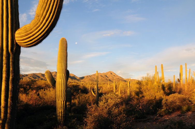
Franze is here this week with a wonderful landscape. This shot defies conventional wisdom inasmuch as it's not wide-angle, or at least terribly wide-angle. It strikes me as more short-to-medium telephoto. This selective composition is quite effective, though. Like several shots this week, it lacks an obvious focal point, but has that wonderful, layered composition. The wheat (?) in the foreground is quite effective, particularly its muted color. The complexity of the trees is a wonderful study, especially against the simple, but not plain, blue sky. 50 bonus points for such a cool title. Nice shot.
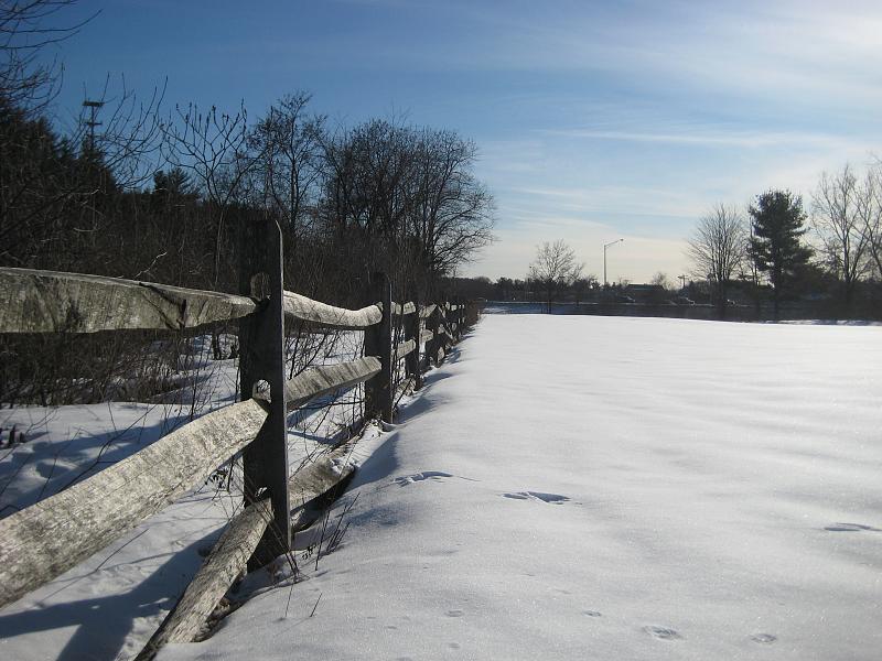
SheRidesaBeemer is here again this week, this time with a snowy landscape. Like others this week, this photo struggles with shooting nearly directly into the sun (see fence post shadows) but it suffers very little due to this fact, just with contrast, in the distance. It is otherwise a very good and very effective photo, putting me in mind of a Frost poem. The snow is quite pretty, and fairly white, with intriguing little foot/hoof prints scattered about. The composition is great--the fence line draws the viewer's eye and leads it through the picture; it adds considerable visual interest as well. The closest, lower fence railing has dropped, too. This picture has all sorts of little interesting details. Not sure how I might improve it. A really nice landscape here.
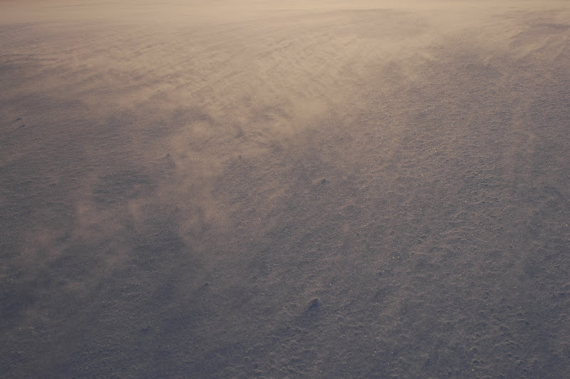
Grossjohann is at it again this week with his "Sunset Tundra." What I like about this picture is that it's utterly abstract and bears no particular relation to the actual object photographed, necessarily. It's entirely a study in form, texture, and light. Gutsy and successful. Such an image invites a great deal of thought and interpretation. I can't help but wonder what this might have looked like with longer exposures, a flash, playing with the white balance, etc. I can't really comment on its fidelity, as it is removed from the original subject and from my experience. As an artifact, it certainly succeeds in grabbing my attention.

Kbasa's here this week with three real treats. I confess this is my favorite. This is a wonderful study in light--a sunset photo that doesn't feature the sun, but instead the sun's light playing across a magnificent landscape. Talk about the golden hours. It's a marvelous composition. The grass, trees, hills, and light all form a quilted texture. There's a fair amount of latitude between the sun-soaked surface and the areas of shadow, but both exhibit admirable detail. One might argue that the image doesn't contain a focal point; another might say the light is the focal point. This is such an appealing and successful landscape image. I really like this one.

Kbasa's second submission is a landscape that is as different and as nice as the first. This shot is a series of layers, and does contain a focal point--the stand of trees. I would only add that this is an object lesson in shooting in the golden light, choosing a specific time of day and taking pictures of light as much as of objects or detail. Try to image this shot at 10:00 a.m. or 2:00 p.m. Pretty, perhaps, but I doubt nearly as effective.

Another great image from Kbasa. This one is really too yellow for my taste, but that is really subjective. The lighting is so dramatic, that I can see how it would appeal. Great composition and very interesting, by virtue of the inclusion of this great focal point, the ancient, dead, mangled tree. The three cows, stacked as they are, and all different, are also quite interesting. I wonder what this would have looked like underexposed slightly. This lighting--in contrast to the image above but like the first image--is very bright and harsh. Still a compelling and interesting still life/landscape.
Poobah has his camera on, no doubt about it. Really nice work this week, Dave.

Nice to see Rocketman back this week, feet firmly on the ground. This is a neat landscape, made interesting by its perspective. The two fencelines are the classic receding lines converging on a vanishing point. That the road rises adds a compelling area of visual interest. The road has a remarkable, mottled surface. It almost appears to be grain in the image, but I'm not sure about that. None evident in the sky. The big crack in the asphalt in the LR corner is perhaps the most visually interesting aspect of the photo and an excellent composition choice. There is an overall blue/purple cast to the image that I wonder about. I've peeked at the EXIF and some of my questions have been answered. This was shot at ISO 1600 with a compact camera--the result is the tremendous grain (or noise) you see in the blacktop. This can be effective as texture in bright light, as it is here, but can be quite annoying in low light images.

Nice to see Bony back, with what might be my favorite image this week. One of the tenets of good landscape photography is framing, and this is a textbook study. Often tree limbs or a fence post, this framing is almost an exploded view. Not entirely clear what this is, but it appears to be shattered or decay, the wall of an old shed perhaps. The jagged edges, the (bullet?) holes, the fading paint all combine for a frame that very nearly competes with the image it reveals. The background--the subject--is a small stream on some farm land. The layers in the landscape and the little bit of foam on the water add such interest and harmonious complexity. Another technical note is how impressive it is that Boney maintains detail between the extremes in latitude between the sky and the shadow on the wood's interior. Fabulous title, too. This is an amazing, wonderful image. I commend you on such a successful shot.
[My wife just walked by and remarked "Ohh, that's pretty!"]

DarcyM has two more very nice landscapes. This first is a great composition. Lighthouse pictures are nearly as clich?® as rainbows, but it's hard not to like them and this is a good one. The choice to include the rock outcropping is an excellent one and is what makes this shot so visually interesting. The rolling hillside, the inclusion of the road, and the ocean all combine to make this effective. I like that the lighthouse is a feature of the photo--apparently its subject--but that it doesn't dominate the image. The only thing I'd change is the dead-centering of the horizon. It's not exactly dead-center, but it's maybe too close. Circumstances may not have allowed for the choice. In any case, a really strong image.

I could almost repeat the above critique for this photo. It's very effective. The flower makes it, the horizon is a bit centered, it's got layers, it's interesting, there's a focal point, etc. It's a very nice image of this flower, too. Imagine if this were merely a close-up of the flower. Pretty, but far less interesting. The wind, simultaneously visible and invisible, is certainly a character in this drama as well. I wonder how this may have worked shot from a different perspective--higher or lower--with the flower slightly farther into the corner? This is second guessing, of course, a really well-executed and successful photo. Nice work, on both counts.
That's it. If anyone has forgotten to migrate a shot over from commentary or has anything else, feel free to post it. I thought we had a really well-managed thread this time and an especially nice crop of photos as well. There are some really talented shooters here.
Franze is here this week with a wonderful landscape. This shot defies conventional wisdom inasmuch as it's not wide-angle, or at least terribly wide-angle. It strikes me as more short-to-medium telephoto. This selective composition is quite effective, though. Like several shots this week, it lacks an obvious focal point, but has that wonderful, layered composition. The wheat (?) in the foreground is quite effective, particularly its muted color. The complexity of the trees is a wonderful study, especially against the simple, but not plain, blue sky. 50 bonus points for such a cool title. Nice shot.
SheRidesaBeemer is here again this week, this time with a snowy landscape. Like others this week, this photo struggles with shooting nearly directly into the sun (see fence post shadows) but it suffers very little due to this fact, just with contrast, in the distance. It is otherwise a very good and very effective photo, putting me in mind of a Frost poem. The snow is quite pretty, and fairly white, with intriguing little foot/hoof prints scattered about. The composition is great--the fence line draws the viewer's eye and leads it through the picture; it adds considerable visual interest as well. The closest, lower fence railing has dropped, too. This picture has all sorts of little interesting details. Not sure how I might improve it. A really nice landscape here.
Grossjohann is at it again this week with his "Sunset Tundra." What I like about this picture is that it's utterly abstract and bears no particular relation to the actual object photographed, necessarily. It's entirely a study in form, texture, and light. Gutsy and successful. Such an image invites a great deal of thought and interpretation. I can't help but wonder what this might have looked like with longer exposures, a flash, playing with the white balance, etc. I can't really comment on its fidelity, as it is removed from the original subject and from my experience. As an artifact, it certainly succeeds in grabbing my attention.
Kbasa's here this week with three real treats. I confess this is my favorite. This is a wonderful study in light--a sunset photo that doesn't feature the sun, but instead the sun's light playing across a magnificent landscape. Talk about the golden hours. It's a marvelous composition. The grass, trees, hills, and light all form a quilted texture. There's a fair amount of latitude between the sun-soaked surface and the areas of shadow, but both exhibit admirable detail. One might argue that the image doesn't contain a focal point; another might say the light is the focal point. This is such an appealing and successful landscape image. I really like this one.
Kbasa's second submission is a landscape that is as different and as nice as the first. This shot is a series of layers, and does contain a focal point--the stand of trees. I would only add that this is an object lesson in shooting in the golden light, choosing a specific time of day and taking pictures of light as much as of objects or detail. Try to image this shot at 10:00 a.m. or 2:00 p.m. Pretty, perhaps, but I doubt nearly as effective.
Another great image from Kbasa. This one is really too yellow for my taste, but that is really subjective. The lighting is so dramatic, that I can see how it would appeal. Great composition and very interesting, by virtue of the inclusion of this great focal point, the ancient, dead, mangled tree. The three cows, stacked as they are, and all different, are also quite interesting. I wonder what this would have looked like underexposed slightly. This lighting--in contrast to the image above but like the first image--is very bright and harsh. Still a compelling and interesting still life/landscape.
Poobah has his camera on, no doubt about it. Really nice work this week, Dave.
Nice to see Rocketman back this week, feet firmly on the ground. This is a neat landscape, made interesting by its perspective. The two fencelines are the classic receding lines converging on a vanishing point. That the road rises adds a compelling area of visual interest. The road has a remarkable, mottled surface. It almost appears to be grain in the image, but I'm not sure about that. None evident in the sky. The big crack in the asphalt in the LR corner is perhaps the most visually interesting aspect of the photo and an excellent composition choice. There is an overall blue/purple cast to the image that I wonder about. I've peeked at the EXIF and some of my questions have been answered. This was shot at ISO 1600 with a compact camera--the result is the tremendous grain (or noise) you see in the blacktop. This can be effective as texture in bright light, as it is here, but can be quite annoying in low light images.
Nice to see Bony back, with what might be my favorite image this week. One of the tenets of good landscape photography is framing, and this is a textbook study. Often tree limbs or a fence post, this framing is almost an exploded view. Not entirely clear what this is, but it appears to be shattered or decay, the wall of an old shed perhaps. The jagged edges, the (bullet?) holes, the fading paint all combine for a frame that very nearly competes with the image it reveals. The background--the subject--is a small stream on some farm land. The layers in the landscape and the little bit of foam on the water add such interest and harmonious complexity. Another technical note is how impressive it is that Boney maintains detail between the extremes in latitude between the sky and the shadow on the wood's interior. Fabulous title, too. This is an amazing, wonderful image. I commend you on such a successful shot.
[My wife just walked by and remarked "Ohh, that's pretty!"]
DarcyM has two more very nice landscapes. This first is a great composition. Lighthouse pictures are nearly as clich?® as rainbows, but it's hard not to like them and this is a good one. The choice to include the rock outcropping is an excellent one and is what makes this shot so visually interesting. The rolling hillside, the inclusion of the road, and the ocean all combine to make this effective. I like that the lighthouse is a feature of the photo--apparently its subject--but that it doesn't dominate the image. The only thing I'd change is the dead-centering of the horizon. It's not exactly dead-center, but it's maybe too close. Circumstances may not have allowed for the choice. In any case, a really strong image.
I could almost repeat the above critique for this photo. It's very effective. The flower makes it, the horizon is a bit centered, it's got layers, it's interesting, there's a focal point, etc. It's a very nice image of this flower, too. Imagine if this were merely a close-up of the flower. Pretty, but far less interesting. The wind, simultaneously visible and invisible, is certainly a character in this drama as well. I wonder how this may have worked shot from a different perspective--higher or lower--with the flower slightly farther into the corner? This is second guessing, of course, a really well-executed and successful photo. Nice work, on both counts.
That's it. If anyone has forgotten to migrate a shot over from commentary or has anything else, feel free to post it. I thought we had a really well-managed thread this time and an especially nice crop of photos as well. There are some really talented shooters here.
Last edited: